Fake Mac OS Leopard Screenshot Contest
In July 2006, I entered a “Fake Leopard Screenshots” contest being held by Phill Ryu for his website. Mac OS X 10.5 (codenamed “Leopard”) was set for release later that year (though it ended up delayed until 2007), and the idea was to predict or suggest features that would be good for that next major version of the operating system.
I’d always had a love for both user interface design and mocking up ideas for said UI, so I entered four images into the contest along with a brief rundown of what I was going for. To my surprise (and delight), I ended up taking first place in the competition. My prize was a selection of free registration codes for a variety of Mac OS software, along with at least a few people saying that I should have a job at Apple.
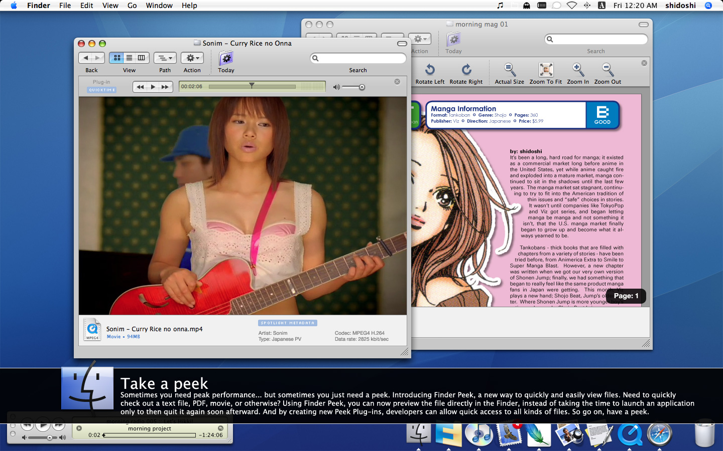
Below is the “what I was going for” description I provided with my entry, along with the four images I submitted. I’ll also point out that my ideas for what Apple could add to the OS predated those features actually coming true, such as: Finder Peek (aka Quick Look), Column View allowing the option to sort by type, dynamics icons where you can play the media straight in the icon in the Finder, and more.
What you were going for:
I think with a lot of the updates that Mac OS X has received over the past couple of revisions, we’ve seen a lot of “wow” features and changes, but what we’re missing is a lot of… hmm, updates that might not be as exciting, but are based more around fixing low-level things to make for a better user experience.
That’s the angle I’m coming from with my mock-ups. I chose features and ideas that might not be mind-blowing, but would hopefully provide for a far better user experience. The biggest ideas, for me, are the ones that go about trying to “fix” Column view. If you aren’t a user of Column view, my submission might be yawn-producing, but if you do use it then you know it currently sucks something fierce. My biggest aim was to provide for a much better Column view experience.
The second biggest was Mail. My girlfriend has gone through a lot of e-mail accounts, and keeping all of her old e-mail organized is a mess. Some mail gets recognized as being from when accessing Address Book, some doesn’t, and I can either have her old e-mail addresses unrecognized, or have them clogging up auto-complete. So, one of the things I want most from Mail is a much stronger system for recognizing mail by PEOPLE, not e-mail addresses. While I was at it, going back through old iChat logs is a pain in the a**, so I figured I could maybe kill two birds with one stone.
The last big feature is visual bookmarks and history in Safari. I’ve had countless, countless times when I remember I site I visited, want to go to it again, but don’t have a clue in the world what it was called. For some, it’ll seem like a small thing, but to me it was something I really wanted to see, so I put it together.
So, I guess, I went a more personal route, going for those things I think need upgrading and fixing, instead of trying to make something “life altering” like Dashboard, Expose, or whatnot. Those things are nice, but to be honest, I’d much rather have a lot of smaller upgrades and fixed in 10.5 than a couple big ones.
Why you should win:
Well, I’d like to think that I have some nice ideas for new features, but what’s important and what’s not in an OS is so subjective. To be totally honest, I had a lot of fun just working on putting together the mock-ups, so I won’t be heartbroken if I don’t win.


