Building the Future—Behind the Design of the Xbox One
During Microsoft’s reveal event for their upcoming Xbox One this week, EGM got a chance to speak to Xbox corporate vice president Ben Kilgore about what went into the design of the system.
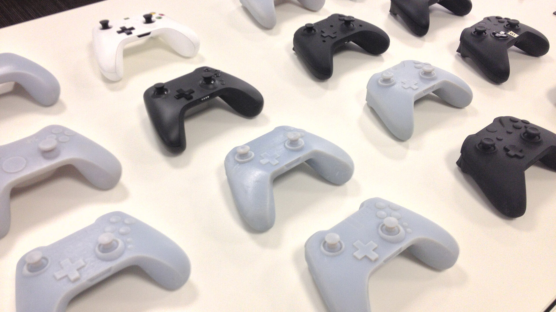
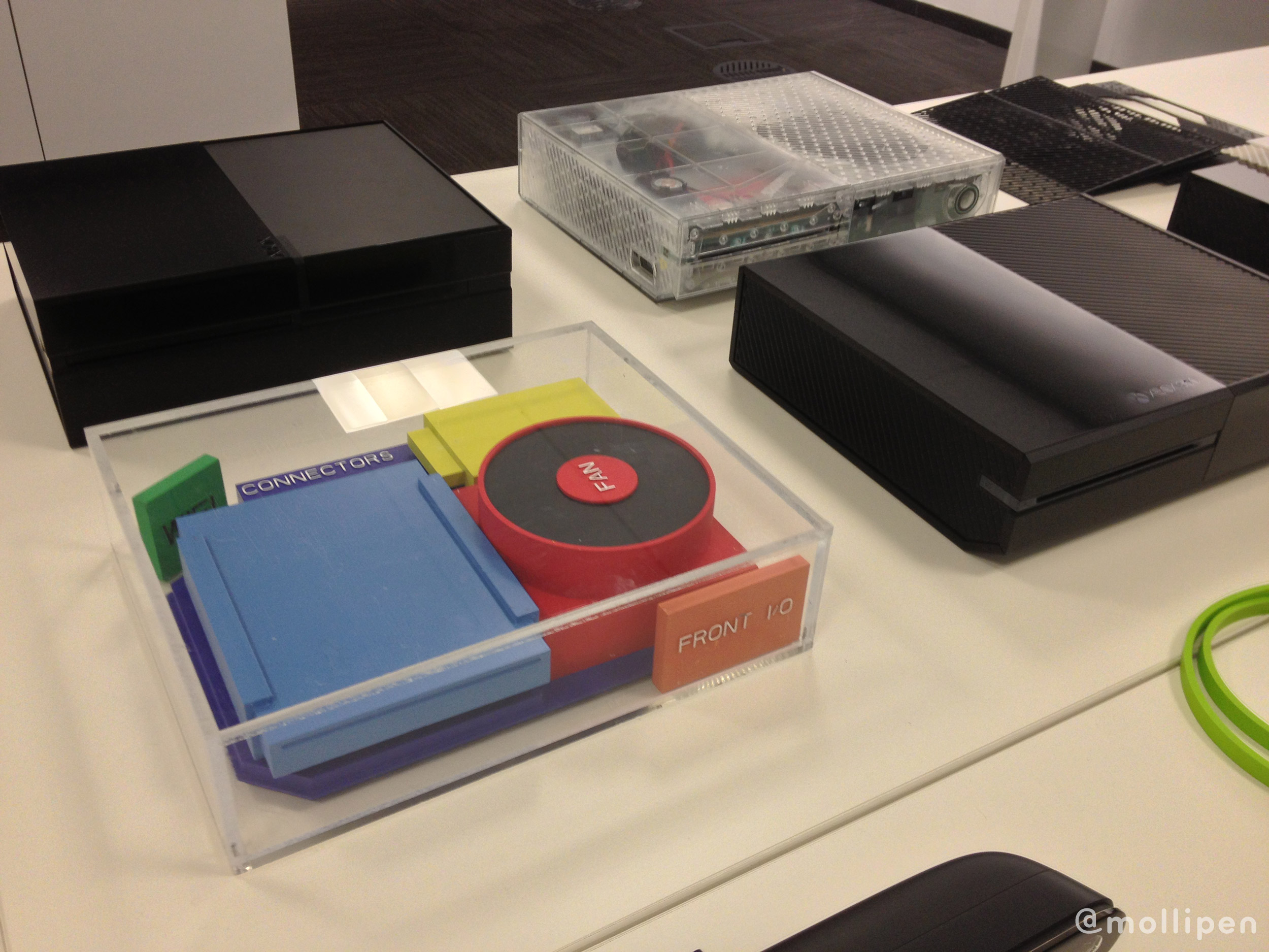
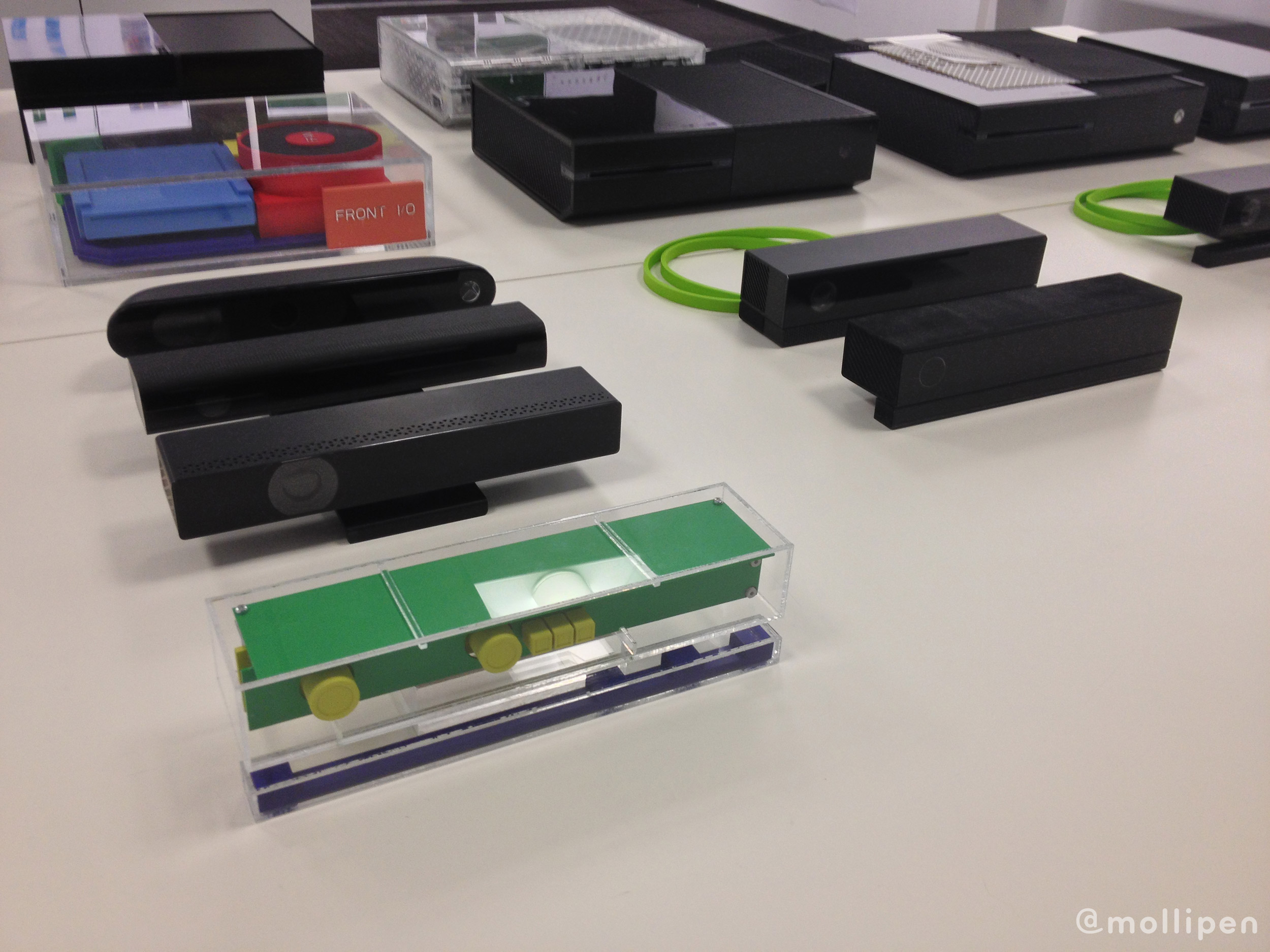
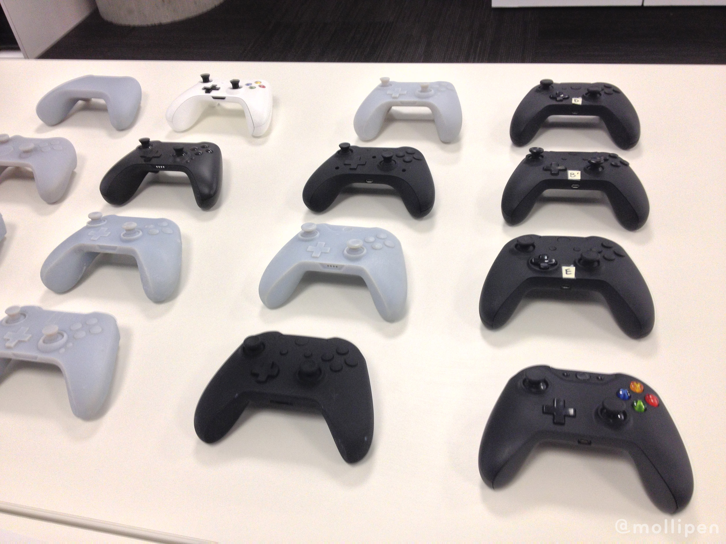
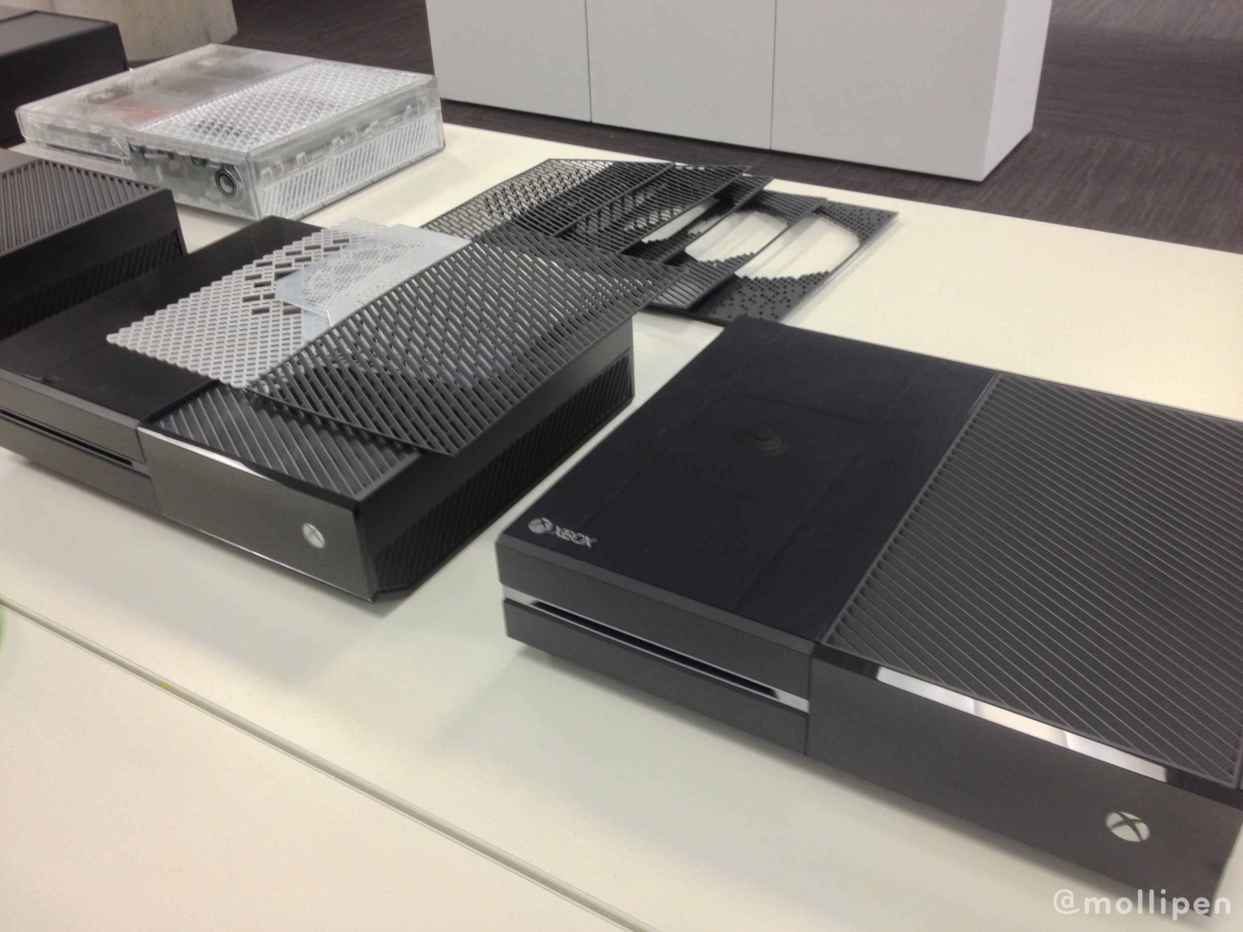
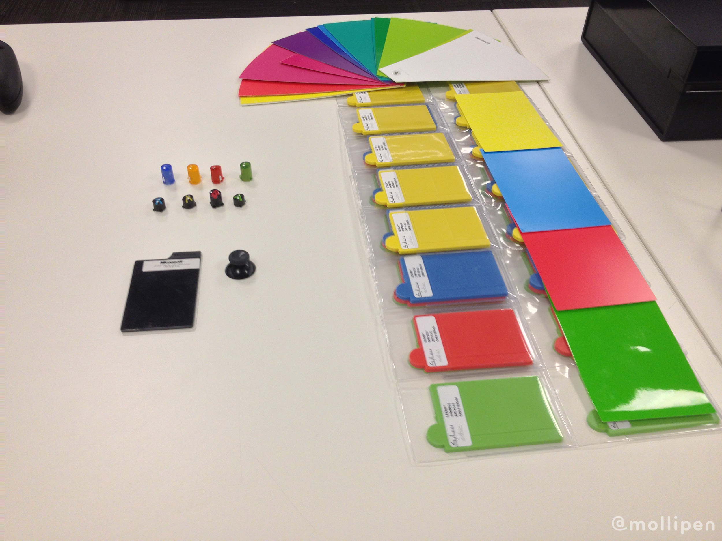
“As you can see from what we have here on the table, you’re literally seeing the evolution of hundreds of different models on the sensor, the controller, and the console itself,” Kilgore told me as we looked across a table containing an array of prototypes. Those prototypes—some of which are shown in the photos below—were just a fraction of what was worked on before the company arrived at the designs they revealed on Tuesday.
“The team starts with a bunch of different ideas for what we call our design languages—which is kind of a brief on, what’s the thing we’re going for, or what is it that we want to communicate,” Kilgore continues. “Part of what we’re trying to get across with Xbox One is this message of, how do we appeal to the core and a broader audience at the same time? We kind of have this interesting challenge. Our industry is based around a lot of core gaming, but our strategy is to be an all-in-one entertainment system.”
With that balance in mind, the team went through a lot of testing and tweaking, all based around that core design language that was first thought up. An example of that language was a 16:9 design metaphor, which was carried through everything from the software and user interface, to the console’s design itself.
One aspect I brought up to Kilgore was the seemingly huge difference in design mentalities between the Xbox One and the Xbox 360. For Microsoft’s current console, we were given a piece of hardware that felt unique, striking, and which came in a color that isn’t always common for home electronics. Now, with the Xbox One—it’s hard to get away from the fact that, essentially, we’ve been given a big, black box.
“Part of what we wanted to accomplish was, while the design is important, we wanted that design to kind of melt away in your living room,” he answered. “We looked at what our mission was, and it was creating this all-in-one system that was simple, instant, and complete. We decided that part of what we wanted to do with the design was have it just melt away with the rest of your electronics, and black kind of fits in with everything you probably have underneath your television—so that it doesn’t stand out.”
There was another, even larger question I had in regards to console design: the question of why we care. I pointed out the fact that I docare what my consoles look like, even if I’m not always sure why. With the PlayStation 4 reveal, we didn’t get to see the system, and that drove a lot of people crazy. Today, we had gotten a first look at the Xbox One, and plenty of people had opinions on it—both good and bad. Why all this concern for how our game-playing machines look on the outside?
Kilgore laughed. “You create this emotional attachment to it. You probably care a lot about the phone you carry, right? I think Apple taught a whole generation of people a lot about how they wanted to think about design on their things. You create emotional attachments to these products. You spend a lot of money on them, and they’re an integral part of your life. And if you’re a gamer, the device that you game on, and that you hang out with your friends on, that’s a really important thing to you. It’s not like the mop in your closet that you pull out every once in a while, and you don’t care, because it’s a chore when you use your mop.
“This is something that brings fun and joy to what you do,” states Kilgore, “and it’s kind of a centerpiece to how you define yourself as a gamer.”
